When political polling and betting odds diverge
I've created a new tool to correlate pairs of time-series datasets. So now you can measure just how much Thursday's debacle split the presidential polling average from the PredictIt odds.
I’ve created a new web site to explore correlations between a pair of time-series datasets:
For example, how closely correlated are A) Joe Biden’s polling average and B) the betting odds of him being reelected over time?
Well, through mid-June (6/15, to be precise), these two datasets were very highly correlated.1
Pearson’s r is a common measure of correlation (note: not the same thing as causation!) between two variables or datasets, and it ranges from -1 to 1. A Pearson’s r of -1 is a perfect negative correlation while 1 is a perfect positive one. A correlation of 0 means the two datasets are entirely unrelated to each other: they have no common pattern.
In the above case, a 0.758 value represents a very strong correlation, which is plainly visible when viewing the two time-series datasets on the above graph: the PredictIt betting odds for Joe Biden’s reelection have tracked very closely with his polling average on 538.
But not so much after…Thursday.
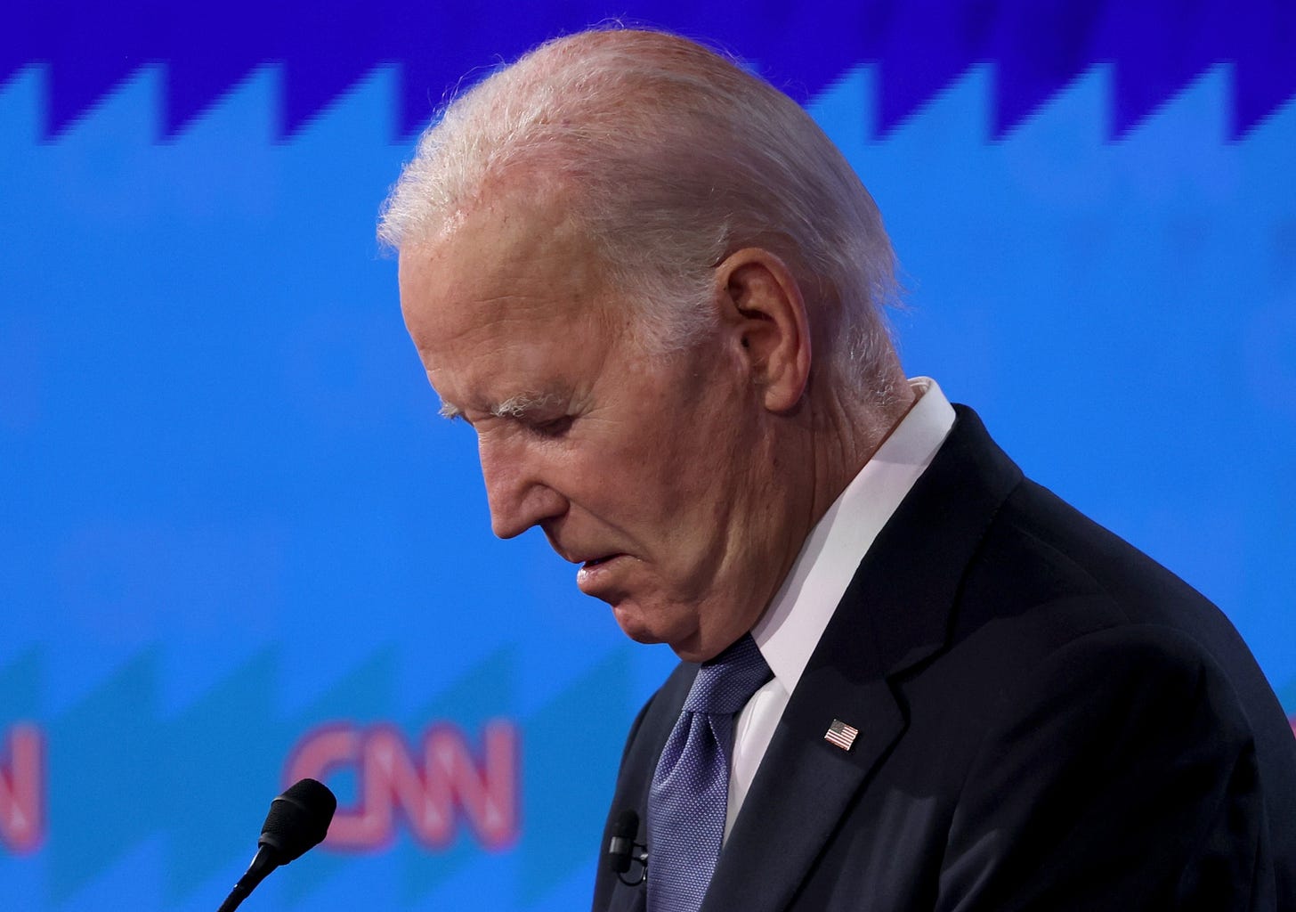
To avoid the risk of wanting to light myself on fire, I’m not going to bother rehashing all the gory details2, but suffice it to say — if you somehow missed it — there is a very long list of places you can check for coverage of what happened at the presidential debate.
For the purposes of this post, however, the most interesting part is that, starting around mid-June (so, well before Thursday, in fact) Biden’s polling average and the betting odds have sharply diverged.
In short, to the extent that people are putting their money on the outcome of this election, they’re now taking a different view than what we’re seeing in the polling. (We’ll likely see a raft of new polls out early this week, which will confirm just how much of an impact the debate had on the American registered voter population.)
Believe it or not, I didn’t start building this web site since Thursday. (The only thing worse than watching that debate would have been spending even more hours working on a side project devoted to it.)
The real inspiration for the site was largely a long and fairly wonky conversation among economists and political commentators stemming from what
notably coined the “vibecession” — the idea that the American economy is in great shape by almost all available metrics but the public consistently feels it isn’t.It’s been an enduring mystery over the past two-ish years: GDP growth is strong, unemployment remains very low, the S&P 500 keeps setting new record highs, and even inflation has come down significantly from its peak of 9.1% in June 2022.3 Meanwhile, consumer sentiment — as measured in surveys, polls, and so on — remains stuck at levels previously only ever seen during recessions. Essentially, ever since COVID, many of the usual correlations between “hard” economic metrics and “soft” consumer-based ones have fallen apart.
For example, take a look at the University of Michigan’s Index of Consumer Sentiment, a benchmark monthly survey that’s been running for decades that asks Americans how they feel about the economy. If you correlate it with the national unemployment rate (as published by the U.S. Bureau of Labor Statistics) up until roughly the start of the pandemic, you’ll see a strong negative correlation — as you’d expect — between how good people feel about the economy and how many people are unemployed as a percentage of the active workforce:
But check out these same datasets starting from August 2020 onward:
The correlation has more than completely flipped: that is, in the period since August 2020, positive consumer sentiment tracks better with high unemployment than low unemployment. That is…absurd.
This general pattern has repeated itself in numerous ways and crucially — if you care about the future of American democracy — it extends to the relationship between the economy and presidential approval.
Above you’ll see a quite weak correlation between the estimated GDP growth rate and Joe Biden’s approval rating, as measured by a Civiqs tracking poll. Shouldn’t these metrics move more closely together?
Anyway, so far I’ve added 15 datasets you can compare. (Reply to this email if you have any ideas for additional ones!) Or you can upload your own datasets as CSV files and run the correlation yourself. There are additional features as well: for example, you can artificially “lag” the second dataset by an arbitrary number of days or months in order to check if e.g., presidential job approval correlates better with gas prices from 3 months ago than their prices today.
Let me know what you think!
Note that this graph has dual y-axes to make the correlation easier to visualize.
OK, just one detail: how is it even possible to answer a question about reproductive rights — which is, in some ways, the foundation of the Democrats’ entire policy platform, and easily their best electoral issue — and meander voluntarily into a discussion of someone who was murdered by an undocumented immigrant? I’ve watched quite a few presidential debates and I think that was easily the single worst self-own I have ever seen. I’m still in disbelief I just lived through that moment.
In one of his few coherent moments in the debate, Biden rhetorically asked anyone to name a leader of a country that’s recovered from the pandemic better than the U.S. He’s right: to quote this Wall Street Journal piece, the American economy right now is the “envy of the world.”


